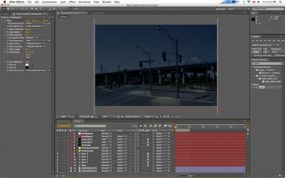
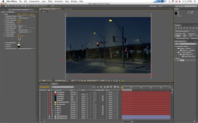
With the help of videocopilot.net (Andrew Kramer is a GENIUS) I learned how to do some Day-to-Night conversion. To learn this technique for yourself, watch his tutorial HERE.
I've provided some screen grabs of what I did to end up with the final result. I just used a still image for practice, but the real one I'm going to do will be video. I just need to FILM the video asset still *sheepish grin*.
1) Original photograph.
2. Crushed the brightness, made it kind of bluey.
3. Made the sky even more inky blue than the rest of the photo. Used a feathered mask to make it blend in with the road.
4. Added some spots on the ground where the street lamps will hit.
5. Added some glow to the street lamps as well as a the fall-off from the light. This wasn't necessary but I liked the look better with it than without.
6. Added some lights to the traffic lights and cross signal.
Friday, June 26, 2009
Day to Night Conversion
Sunday, May 3, 2009
the launch of lauranicole.ca
For a few months, I had the address lauranicole.ca redirect to this blog, in lieu of putting up a real website. However, since graduation, it's occurred to me that I'll be needing to have an actual website upon which to host my portfolio and stuff. So I finally cracked and bought a hosting package and now if you go to lauranicole.ca you'll be directed to a page with a "coming soon" flash video on it and several links (one of them leading here).
If you visit that page you'll also notice that I've given myself a deadline to finish the thing: two weeks. And I'm really going to try to stick to that deadline and have the website all worked out in two weeks for its final launch onto the interwebs. It might also co-incide with the launch of my new live webcast show. I'm not sure.
On this blog I'm going to be posting some of my progress, including images, and links to resources that I have found to help me. So here's the first bit.
I used www.videocopilot.net to help me with the coming soon page. It's in a tutorial called "Disintegration" that's really super helpful. Though the lighting was my idea. I liked the way it looked like it was a light shining through water and the words were floating off into the murky depths...
Here's some stills of the "coming soon" animation:

Sunday, February 8, 2009
"Paper Towns" Kinetic Typography Style
Yeah. It was featured on nerdfighters.com on the front page and I am KIND OF really super proud of it. Considering that it's the first time I've made a kinetic typography video, it's not half bad. I used After Effects and a lot of time and creativity to create this.
EDIT:
Found this on John Green's Website.
Has my day been made? Absolutely. I mean, the guy is pretty much one of my favorite people ever and he posted it on his blog, and said it was amazing.
I feel awesome right about now, thanks.
